Sure
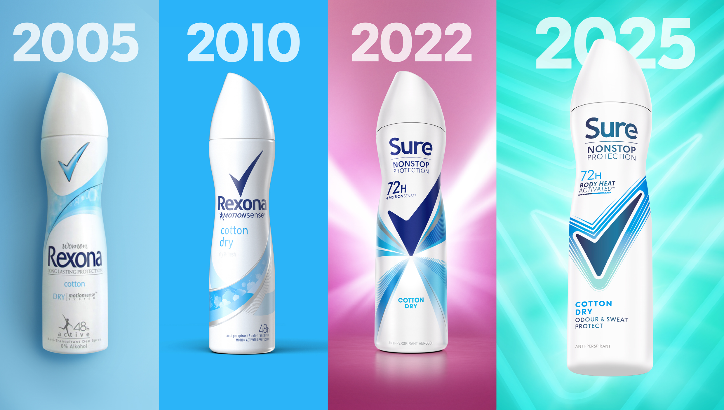
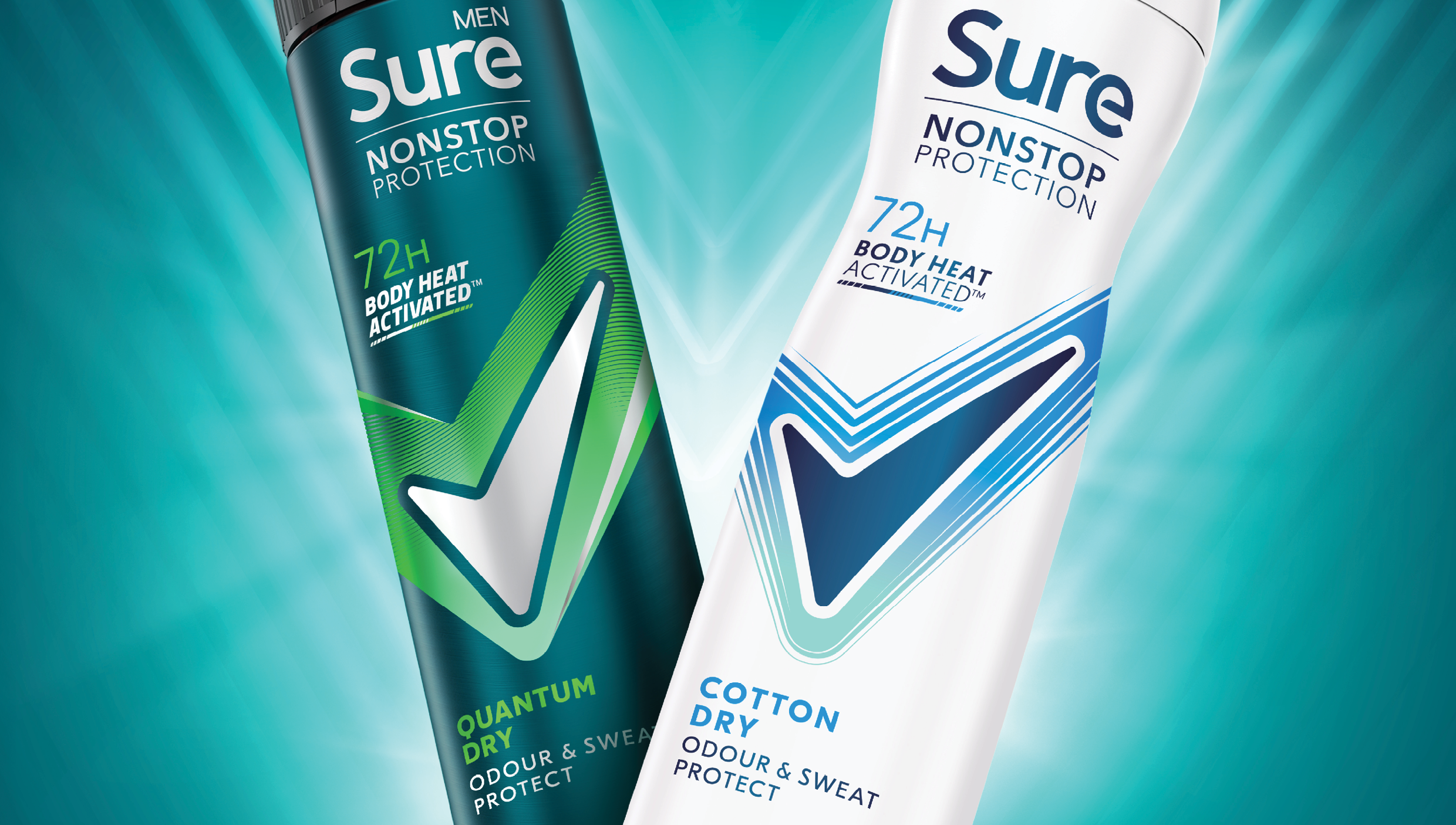
Sure needed a refresh to stay relevant and competitive in a crowded market. The redesign introduced a bold, single-minded visual identity built around the iconic Tick, now elevated to convey greater efficacy, energy, and activated movement.
With such a broad global portfolio, consistency was key. The new design ensures that the brand’s confident message comes through clearly across every pack and format. Even in motion, the identity carries the same sense of momentum and performance, reinforcing Sure’s role as the deodorant that keeps up with every move.