Designed to Save Lives: The Typography Behind Healthcare
A breakdown of how great typography impacts lives every single day
4 min read · Jul 1, 2025
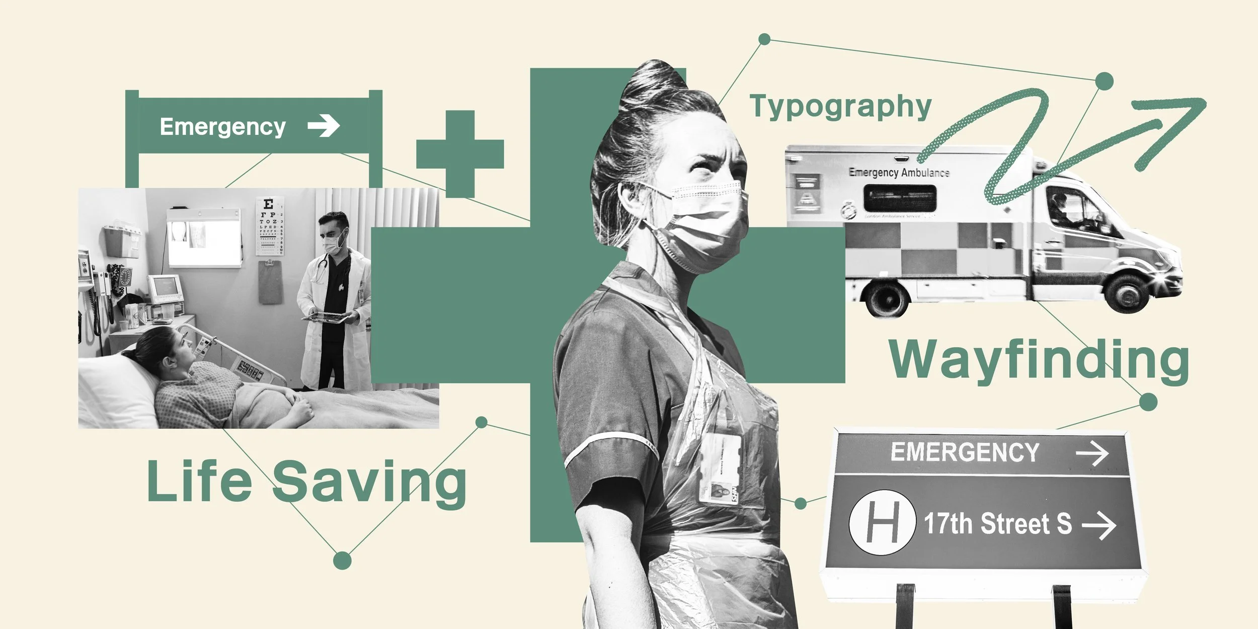
Image designed by author
Do you know that good typography can save lives?
While it’s true that it won’t perform CPR on a person, it plays a very important role in hospitals.
Typography’s role in healthcare is not new. It dates back long ago, since hospitals started becoming official institutions.
Back in the 19th century, hospitals needed to formalise their signage and documents.
Florence Nightingale, the founder of modern nursing, herself pushed for the standardisation of legible data in charts and records.
She brought a visually analytical approach to medicine, influenced by her studies of maths from an early age.
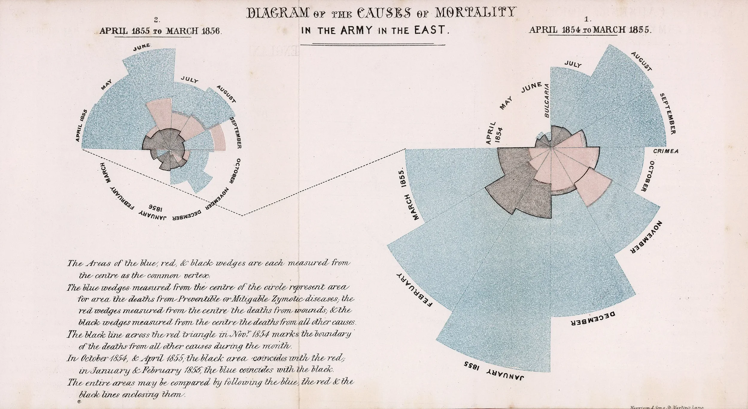
Diagram of the causes of mortality in the army in the East by Florence Nightingale (Source: Wikimedia Commons)
The image above shows how Florence used charts and data to show how soldiers were dying more from diseases than injuries.
She didn’t just throw numbers at people, she used visual design to make the message hit home.
She used clean type, colour, and layout to make a powerful case for better military healthcare. And it worked!
Modern Problems, Modern Type Solutions
Fast forward to the 20th century, and typography started to get a bold new look.
Typefaces like Helvetica, Univers, and later Frutiger became popular for being super readable and visually neutral.
They’re everywhere now, but back then, most signage was still handwritten, so the shift to clean, consistent typefaces was a big deal.
One of the biggest changes came with designers Margaret Calvert and Jock Kinneir. In 1957, Kinneir was appointed head of road signage in Britain and brought Calvert on board to help with the big project.
At the time, new motorways were being built across the UK, but signage was often an afterthought, making driving confusing and even dangerous.
Together, they created a completely new system using clear typography and easy-to-understand pictograms.
It worked so well, the system eventually expanded to hospitals and other public spaces.
I highly recommend checking out the Design Council’s interview with Margaret Calvert, it’s a fascinating look into her work and life as a designer. You can watch it here.
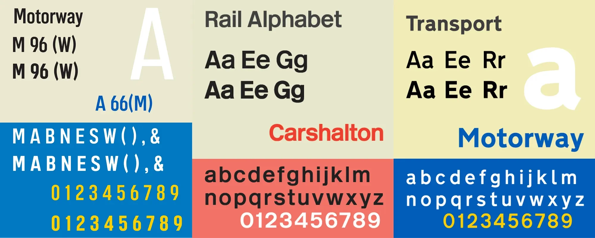
Left: Motorway Font (Source: Wikimedia Commons). Middle: Rail Alphabet (Source: Wikimedia Commons). Right: Transport Font (Source: Wikimedia Commons).
So what made this new design system so successful?
Because it isn’t flashy. It is practical.
It was designed to handle real-world challenges: low lighting, high stress, fatigue, language barriers, and visual impairments, all things that make reading in hospitals difficult.
I’ve been learning Hindi and I’ve noticed how tough it can be to recognise the same letterforms across different fonts. Handwriting, especially, trips me up.
That’s why a clear, consistent type system like this is so important.
Overall, this new design system set the standard for what good public typography should look like. It laid the foundation that many healthcare typefaces still follow today.
Now, let’s break down the key elements that make it work.
Breaking Down What Makes Type Life-Saving
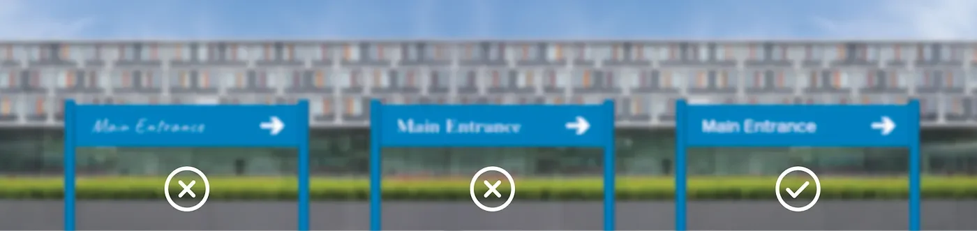
1. Typeface
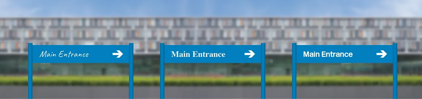
Image 1: In this image with three hospital navigation signs, the left one uses a handwritten typeface, the middle one uses a serif typeface, and the right one uses a sans-serif typeface.
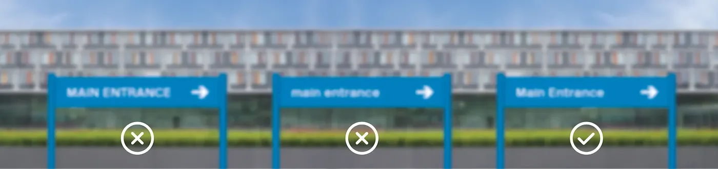
This is how Image 1 looks to someone with low vision.
This example shows exactly why the choice of typeface is important.
The non-uniformity of the hand written typeface makes it hard to see when a word begins and ends.
Similarly, the thicks and thins of a serif typeface makes it difficult to recognise letter shapes.
2. Case
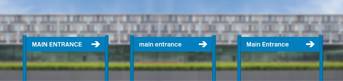
Image 2: The left sign is upper-case, the middle is lower-case, and the right is title case.
This is how Image 2 looks to someone with low vision.
Title case wins here. It offers the best structure for readability, uppercase letters give shape to the start of words, helping users quickly scan and understand what they’re seeing.
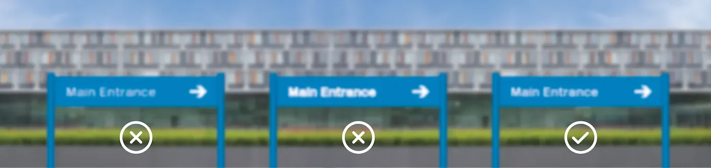
3. Weight

Image 3: The left sign is light, the middle is heavy, and the right is medium.
This is how Image 3 looks to someone with low vision.
Light type fades into the background. Heavy type blends together. A medium weight strikes the right balance, it’s strong enough to stand out but not overwhelming.
4. Colour
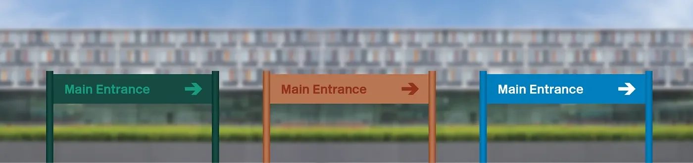
Image 4: The left sign is low contrast, the middle is low contrast, and the right is high contrast.

This is how Image 4 looks to someone with low vision.
Two things matter here:
The type must contrast with the background
The sign must stand out against the physical environment
In the example image above, the left and middle signs blend into their surroundings. The high-contrast sign on the right stands out clearly, just as it should.
I’m fascinated by the small details in design, the ones most people don’t even notice.
But that’s the point. Designers obsess over those details so things work effortlessly, especially in places like hospitals where clarity matters most.
It’s through the careful craft of every aspect of a typeface that means it fulfils its purpose: guiding us, informing us, and sometimes even helping save lives.