The Hidden Dangers of Poor Packaging Design & the Life-Saving Solution
A look at the redesign that made medication safer for millions
4 min read · Jul 5, 2025

Image designed by author
Back in 2005, poor design had a direct impact on Deborah Adler’s family.
Her grandmother accidentally took her husband’s medication after confusing two nearly identical pill bottles.
That moment of confusion wasn’t her fault, it was a symptom of a bigger problem, one caused by poor design.
Adler was a design student at the time and decided to turn her grandmother’s mistake into a design brief.
She redesigned prescription bottles as a thesis project, and the result was incredibly impactful.
The Problem: Confusing, Cluttered, and Unsafe
To understand the problem, it helps to know that prescription packaging wasn’t originally designed for patients.
It was created to serve pharmacists, professionals trained to understand the terminology used on labels.
But patients, especially those taking multiple medications, have to navigate these labels every day without a pharmacist by their side.
As an article on PubMed Central (PMC) points out (click through here), prescription labels often focus more on legal and regulatory rules than on making things clear for the people actually taking the medication, leading to a lot of confusion and mistakes.
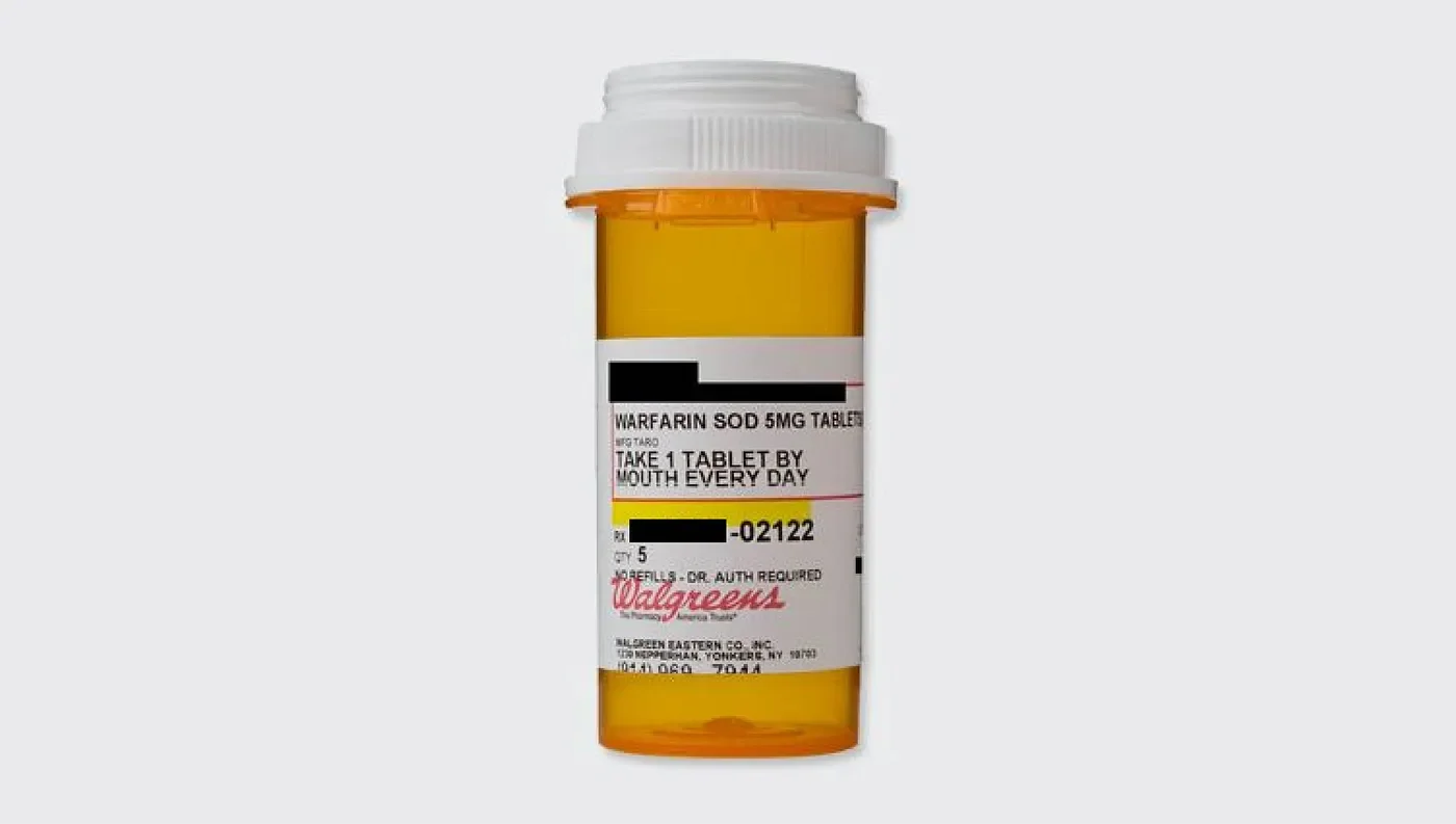
Walgreens prescription bottle. Personal information about the patient is censored (Source: Wikimedia Commons)
Here’s what made the old system so problematic:
Poor information hierarchy: Important details like dosage and timing were buried and hard to find.
Tiny type: A major issue for anyone with vision loss.
Branding overload: The pharmacy or drug brand was often more prominent than the actual instructions.
No clear distinction for different family members: Adler’s grandparents, Helen and Herman Adler, both had “H Adler” on their medication bottles, easy to mix up.
Unclear numbers: Labels often include numbers meant for pharmacists to understand, like internal codes or refill counts, that aren’t relevant to patients. Without context, patients might mistake these for dosage instructions.
All in all, the design wasn’t patient-friendly, making it potentially dangerous.
The Solution: A New System, Rooted in User-Experience
Adler set out to fix these problems. Her goal was to design for users, making the most important information unmissable.
With help from Brooklyn-based designer Klaus Rosburg, she created ClearRx, a totally reimagined prescription packaging system.
The design caught the attention of major U.S. retailer Target, which adopted it for use in more than 1,600 of its in-store pharmacies.
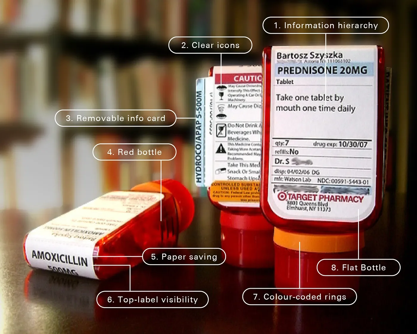
Target ClearRx prescription bottles (Source: Wikimedia Commons) annotated by author
Here’s why it worked (I’ve numbered each point to match the image above, so it’s easier to follow along):
1. Information hierarchy: Critical info (like the drug name and how to take it) is prioritised. Less urgent info (like the doctor’s name or quantity) goes below.
2. Clear icons: User-friendly icons make health warnings easier to understand.
3. Removable info card: Instead of tossing the paper insert, patients get a removable card that clips into the bottle itself.
4. Red bottle: The red bottle colour became a Target signature and helped the bottle stand out in households with families taking different brands’ medication.
5. Paper saving: Klaus Rosburg designed an upside-down version that stands on its cap, which became the final design. This meant that the label can be wrapped around the top, eliminating the need for two labels and reducing paper waste.
6. Top-label visibility: The prescription information is visible even when the bottle is stored in a lower place like a drawer.
7. Colour-coded rings: Each family member gets their own colour-coded rubber ring to avoid mix-ups.
8. Flat bottle: Easier to read than curved bottles, with no distortion of the type.
Built-in magnifier: A thin magnifying lens was included to help users read fine print.
The Results: Real Impact, Backed by Data
ClearRx wasn’t just a smart design, it made a real difference.
When Target rolled it out in 2005, it marked the first major redesign of prescription bottles since World War II.
It stood out immediately with its bold, modern look, but more importantly, it worked.
Studies backed this up:
A 2006 study published in the Journal of the American Pharmacists Association found that most patients preferred ClearRx over traditional bottles. They said it was easier to read and felt safer to use.
In 2007, another comparative study published in the National Library of Medicine reported that 85% of participants chose ClearRx over the standard format. They highlighted better label readability and clearer warnings, and features like the info card helped reduce errors.
In 2021, a broader study (not specific to ClearRx but relevant) published in BMJ Open found that clearer, more patient-friendly labels helped people better understand dosage instructions, especially compared to standard labels.
I’m amazed by Adler’s work. She brought empathy into every detail, designing with a deep understanding of what real users need to safely manage their medication.
ClearRx is proof that when designers are brought into healthcare, they can make systems safer, easier, and more human.